JetBlue | Homepage
Platform: Web | 2020
On the heels of a rebrand and website redesign, JetBlue focused efforts on homepage optimization, the page with the highest traffic.
Team & Role
Agency
Producer/PM
Product Design Lead (me)
VP, Account Management
JetBlue
Product Manager
Design Manager
Development team lead
SVP, Product
VP, JetBlue Vacations
The Problem
The updated website was underperforming and drop-off was occurring at the top of the funnel during a time when travelers were concerned about COIVD-19 safety
Goal
Increase booking conversion rate by serving both people who were nervous about traveling as well as those who were fully comfortable and see JetBlue as their only provider.
Research & Insights
Stakeholders
Current prioritization of the booker leaves little room for personalization of other messages and merchandising efforts. Business priorities are important, but relevance to the customer is more crucial
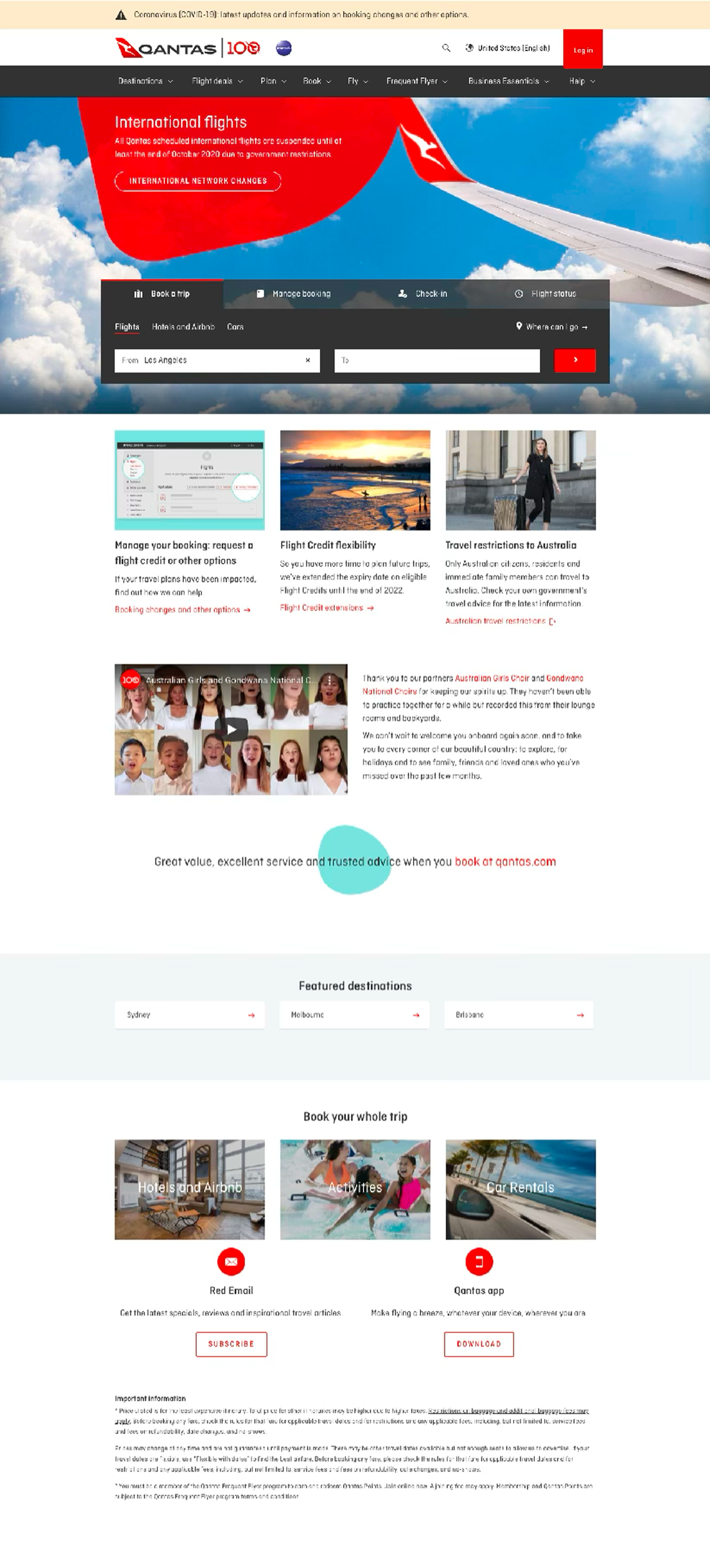
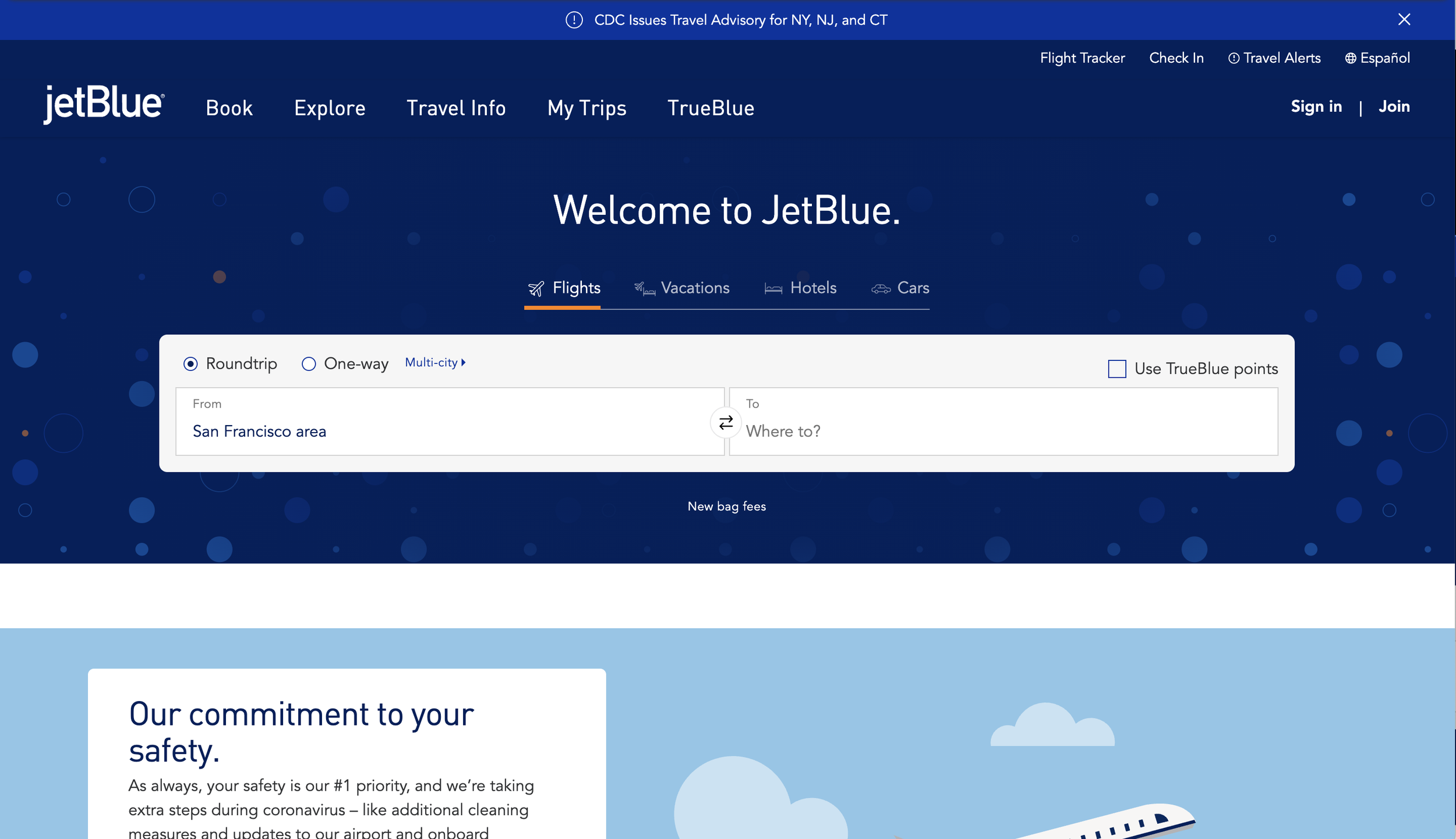
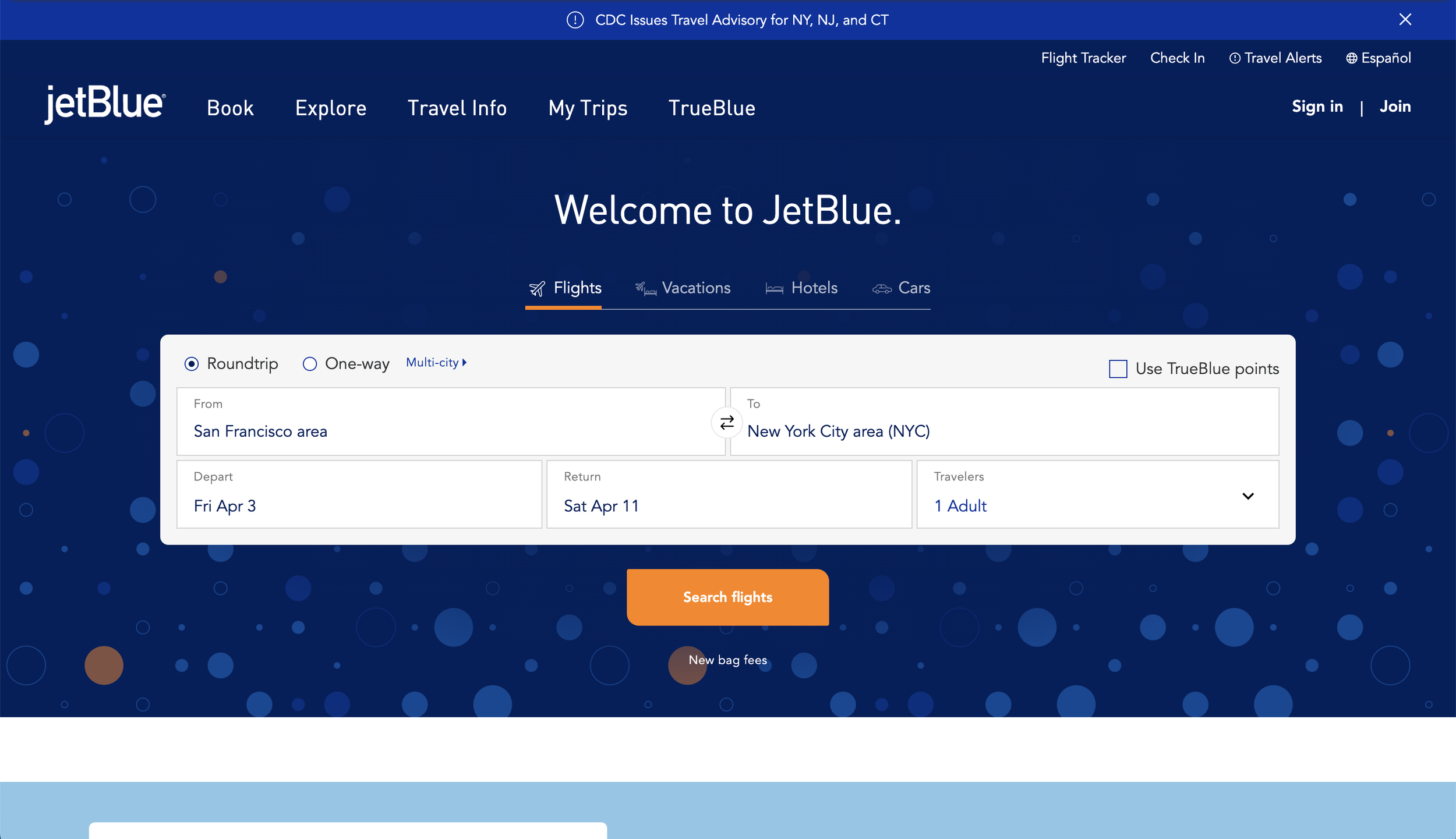
Competitive Audit
Airline brands are consistently falling into one of three camps on their homepage.
Leading with the booker
Split header
Leading with messaging
Usability Study
Methodology
Utilized JetBlue’s usertesting.com account
Moderated usability interviews with 10 frequent JetBlue.com users
Focused on the current booker component on the Homepage
Booker was tested in desktop and mobile viewports
Users were asked book a specific flight and then asked to book a flight on a frequent route
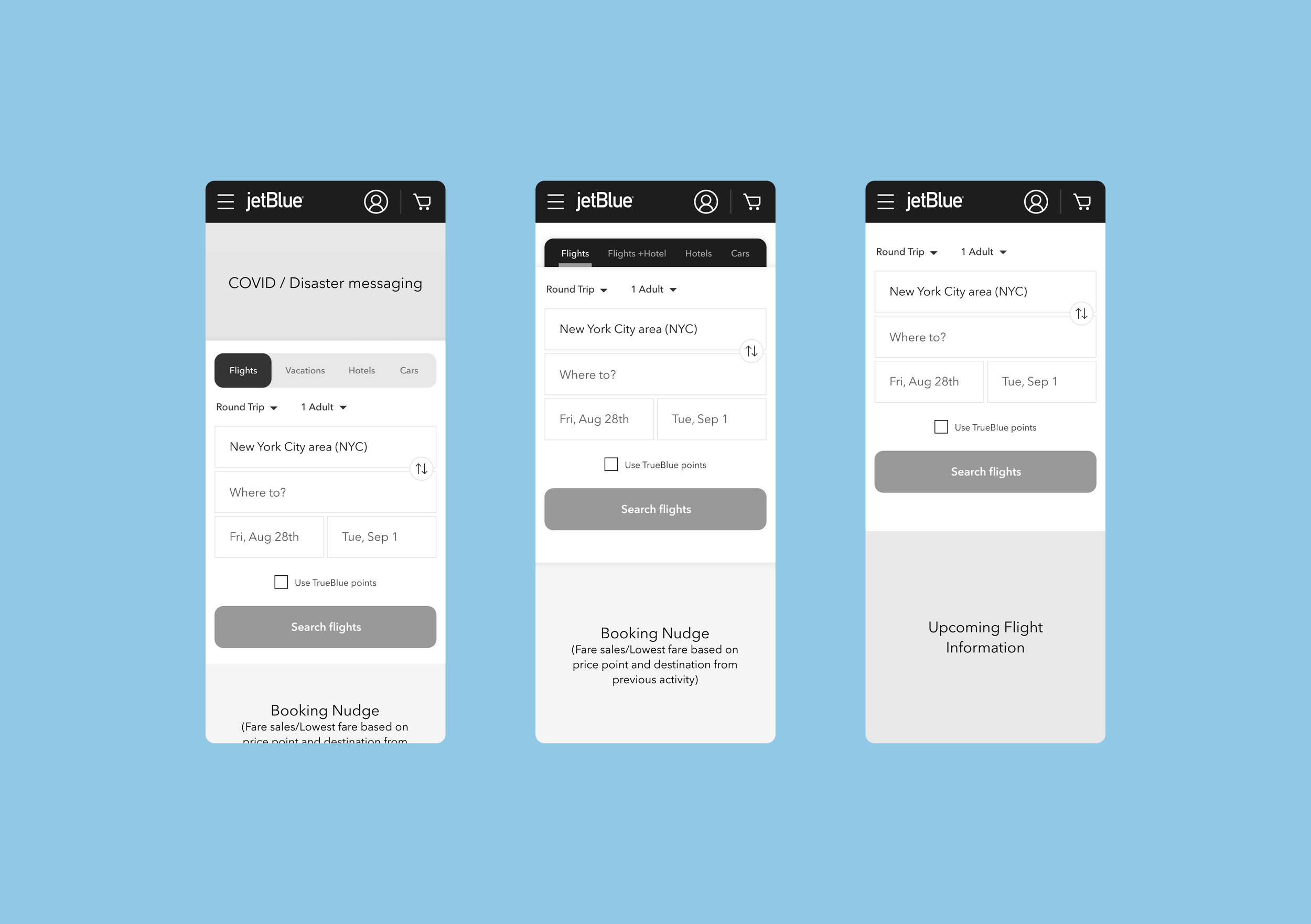
Usability Study Findings
Key Findings
Users found it frustrating that options like departure/return dates and number of travelers were hidden by default
When the booker expanded to reveal all options, users found it jarring
Several users found the CTA to be confusing/non-standard
Users confirmed no desire to book anything other than flights and ignored the options for hotels, cars, etc.
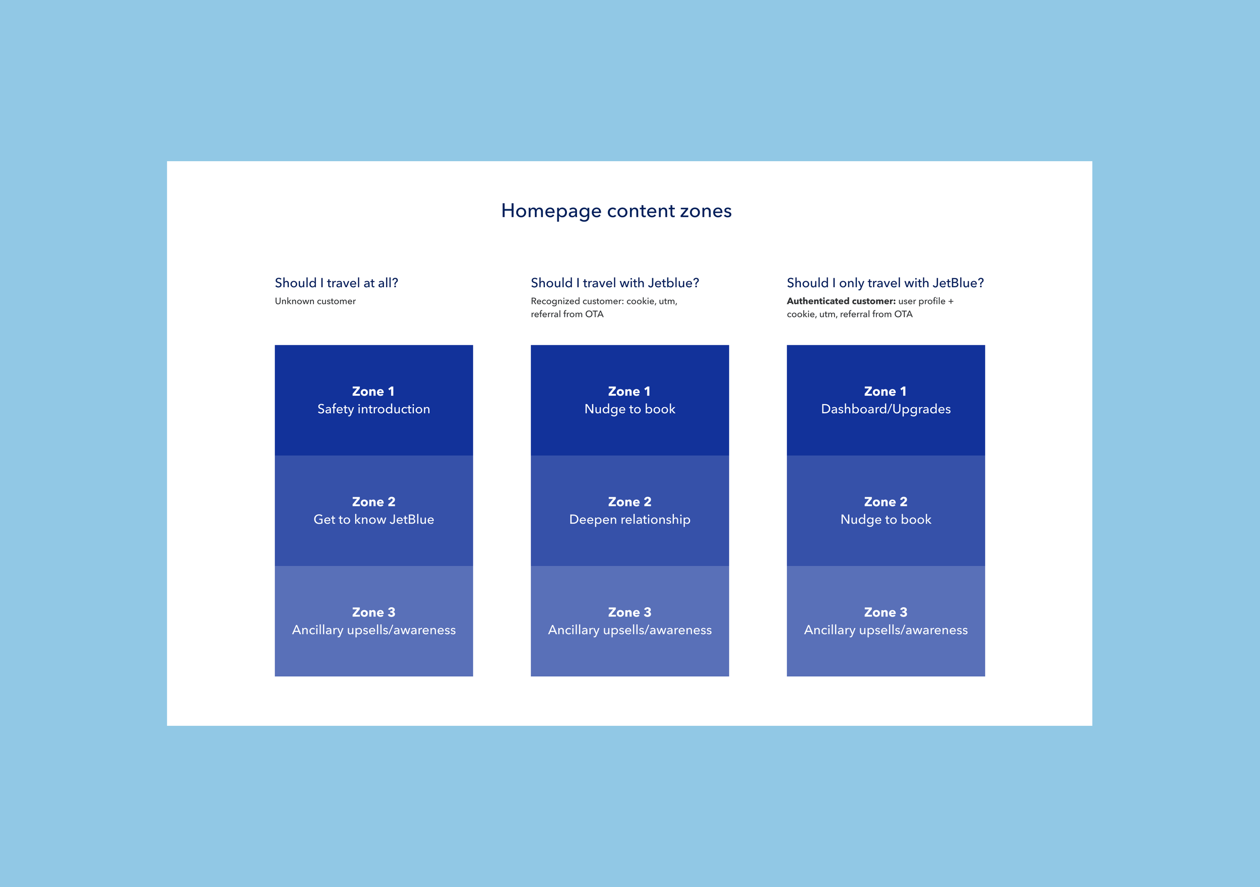
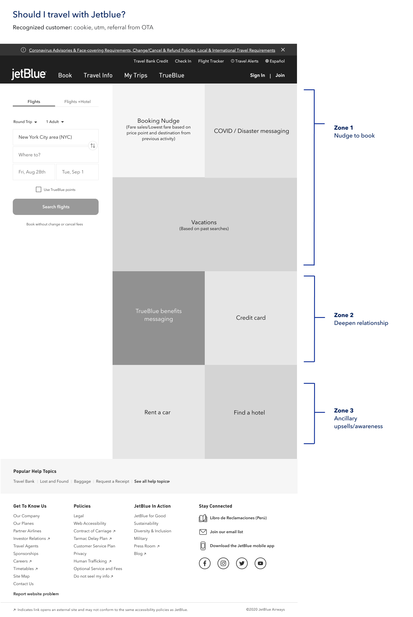
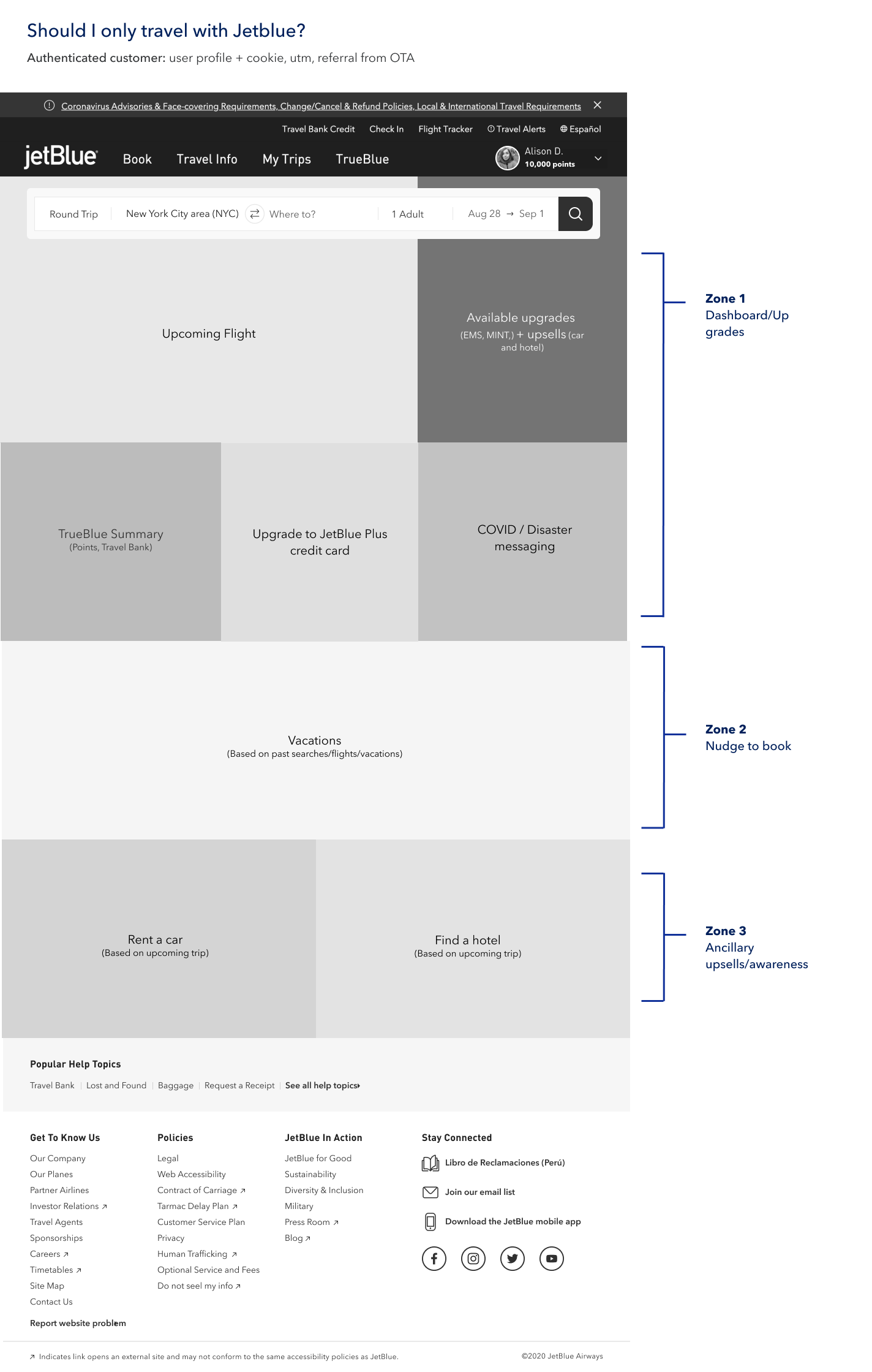
Homepage Strategy
Flexible Templates
A successful homepage will actually be a series of homepages — allowing for different business priorities and customer states
Personalization
Starting with the data we have available, build a personalization strategy that can evolve and expand as identification becomes more sophisticated
Iteration
Hand-in-hand with flexibility and personalization is the ability to test and iterate on learnings — from language to placement of modules, the homepage must evolve as we learn
Wireframe explorations
Highlights
Booker placement: Below key message, Several users found the CTA to be confusing/non-standard
Booking type (Flight, hotel, cars): Show all, show the two top performing, hide all together and focus on flights-only.
Can we remove the “TrueBlue” points checkbox and defer that choice to the results page?

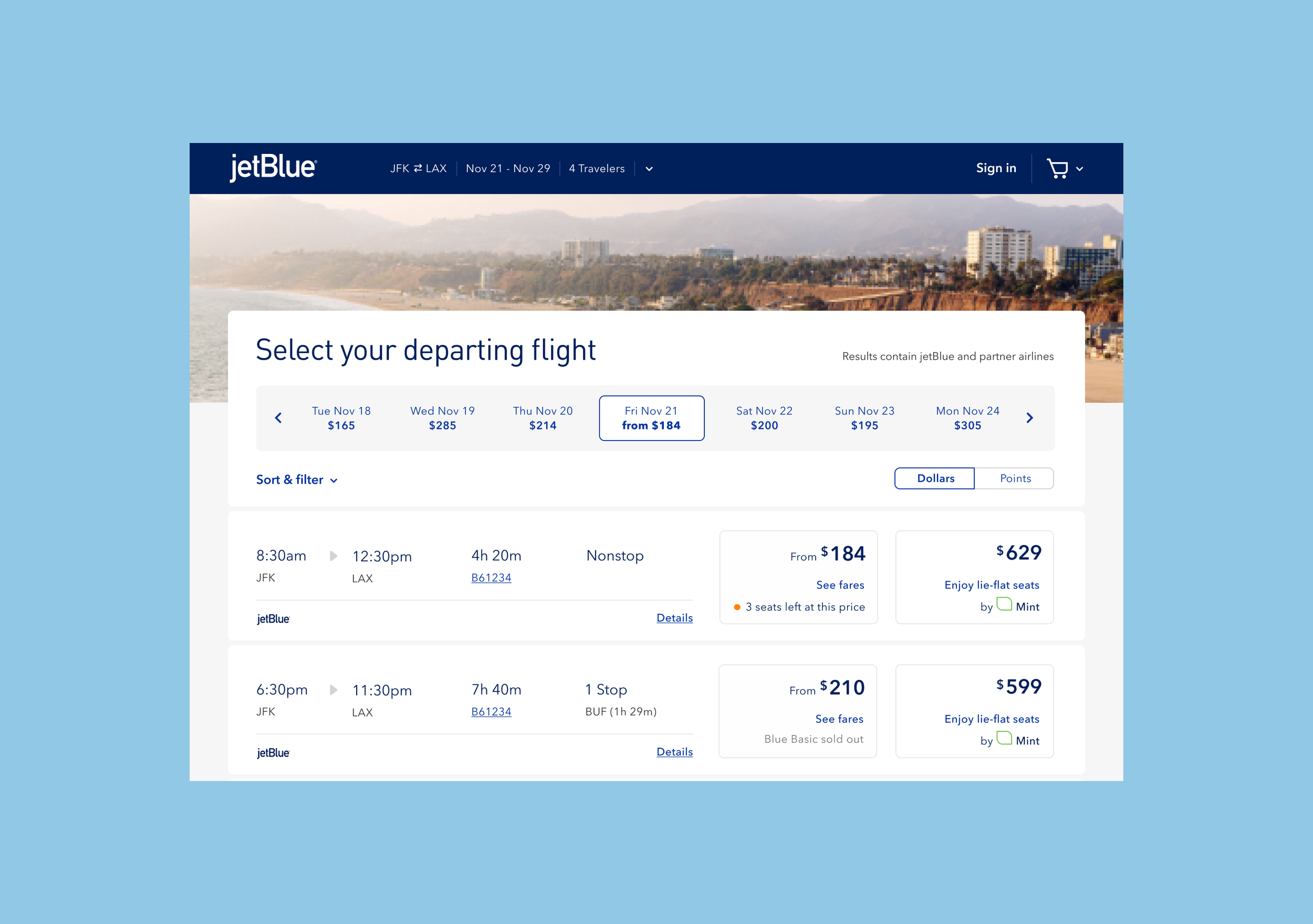
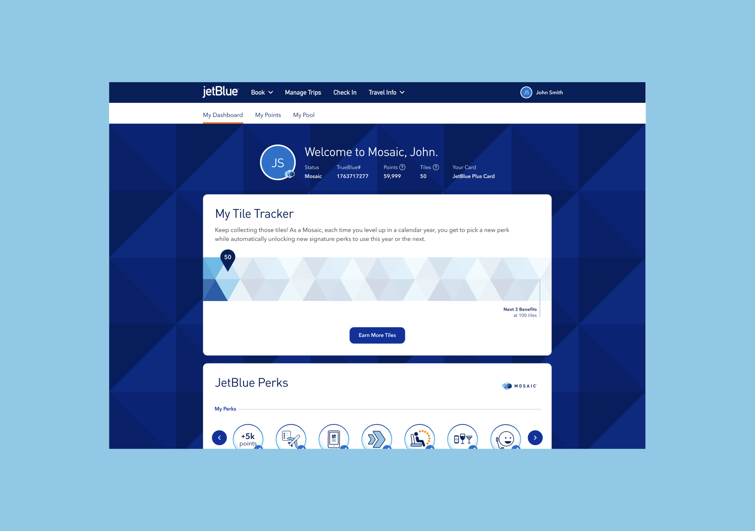
Final designs
Where we landed 🛬 😉
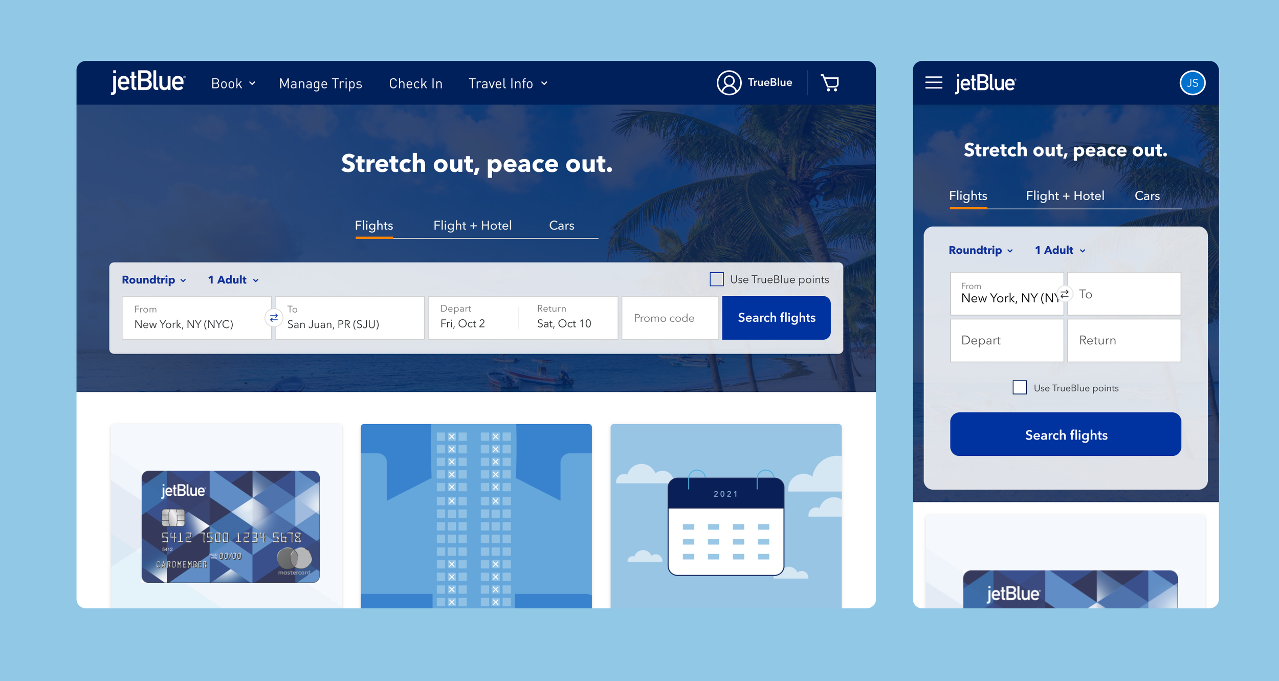
Design highlights
A selection of design comps from the booking flow and the TrueBlue loyalty program.